This might help laptop cameras to adopt to the brightness of the mobile screens faster in meetings.
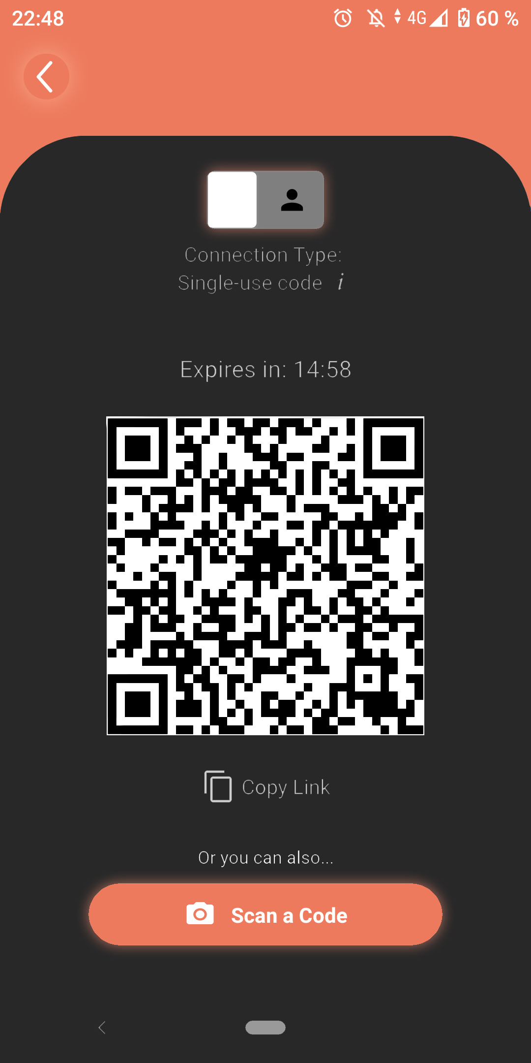
I’ve also added a glow around clickable buttons so users recognize them faster. I am thinking about making the white border around the QR code a bit broader and add rounded edges to match the overall design language of the app.
I can do this for every page the app is using if needed. In that case it would make my life a lot easier if I could get access to the design files so I don’t have to make manual selections of each design feature. Photoshop has very nice selection tools but depending on the design of the feature it is still hard to make an accurate section in some cases. On top of that the selections are not 100% accurate sometimes.
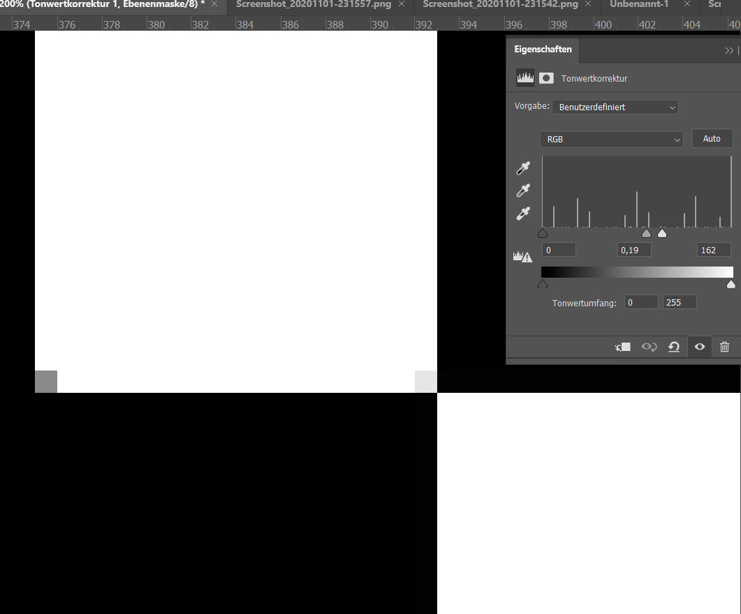
While editing the screenshot I’ve also noticed that the QR code is not 100% sharp. I’ve applied a tonal value correction and was able to improve that to some degree. Not sure what is causing this issue but fixing it might improve the ability to scan the QR code.
Hi Serge, I like the idea about the dark theme. Many apps have provided a dark theme too. I haven’t think about it since we were focusing on developing the main theme (the bright theme). This is a great input!
However I think there could be a better way to design the dark theme (especially the color selection). I’ll start brainstorming on this and share the draft with the development team
I agree. Graphic design is not my profession, it’s just a hobby . My strengths in Photoshop are image post processing and image manipulation.
I’ve selected the standard grey background in Photoshop to visualize the idea quickly, I should’ve stated that in my initial post.
The glow around the connection type slider and the scan a code button could use more opacity/a broader glow to make them pop out more. The back button on the top left could be a rounded rectangle and instead of the glow a shadow could be used to name a few possibilities.